TE.A
Identity & Packaging Design
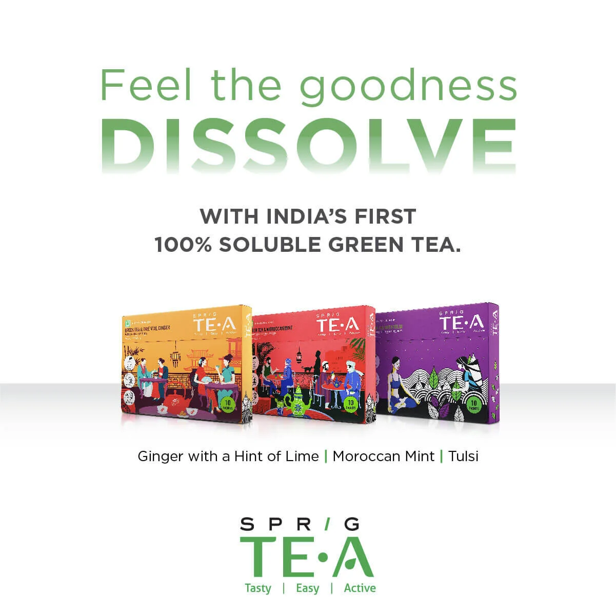
An innovative product like SPRIG’s quick-dissolve TE.A deserves packaging that’s just as innovative. The product promised green tea from the tea garden straight to your cup. And so, we’ve brought this story alive through a graphic illustration style on product packaging. The individual sachets too have some of the graphic elements from the pack, as a reminder of where the tea comes from.
The product pack is uniquely designed to open up like your personal tea drawer. While a sliding tray brings out the sachets, the flap on top gives you a glimpse of the healthy and active lifestyle that you’ve chosen for yourself with the tea. From the vibrant colours down to the little perforation in the shape of a leave, every detail of this packaging is designed to delight and energise your senses.
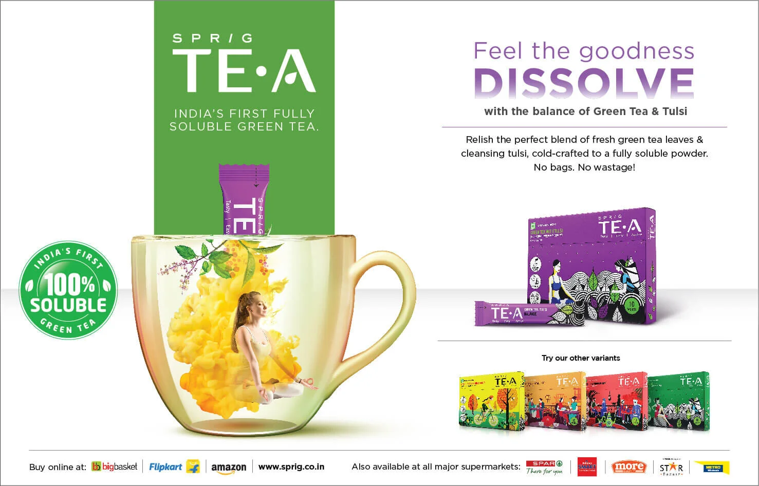
Press Ad
Digital Ads
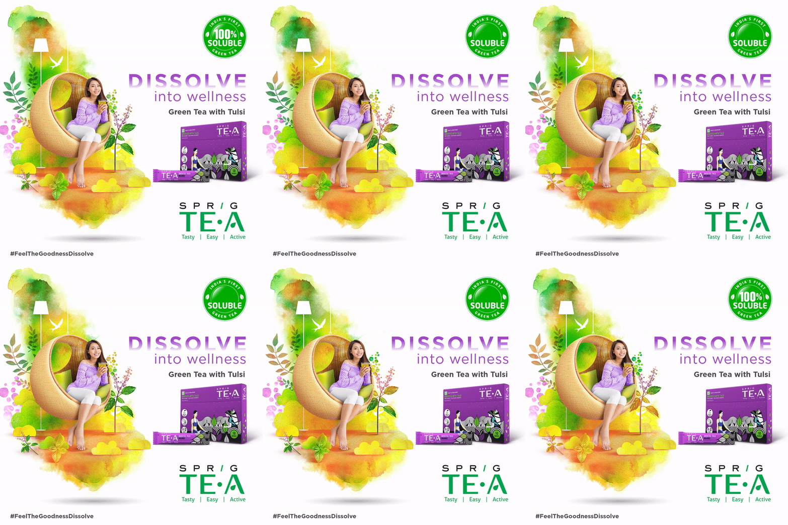
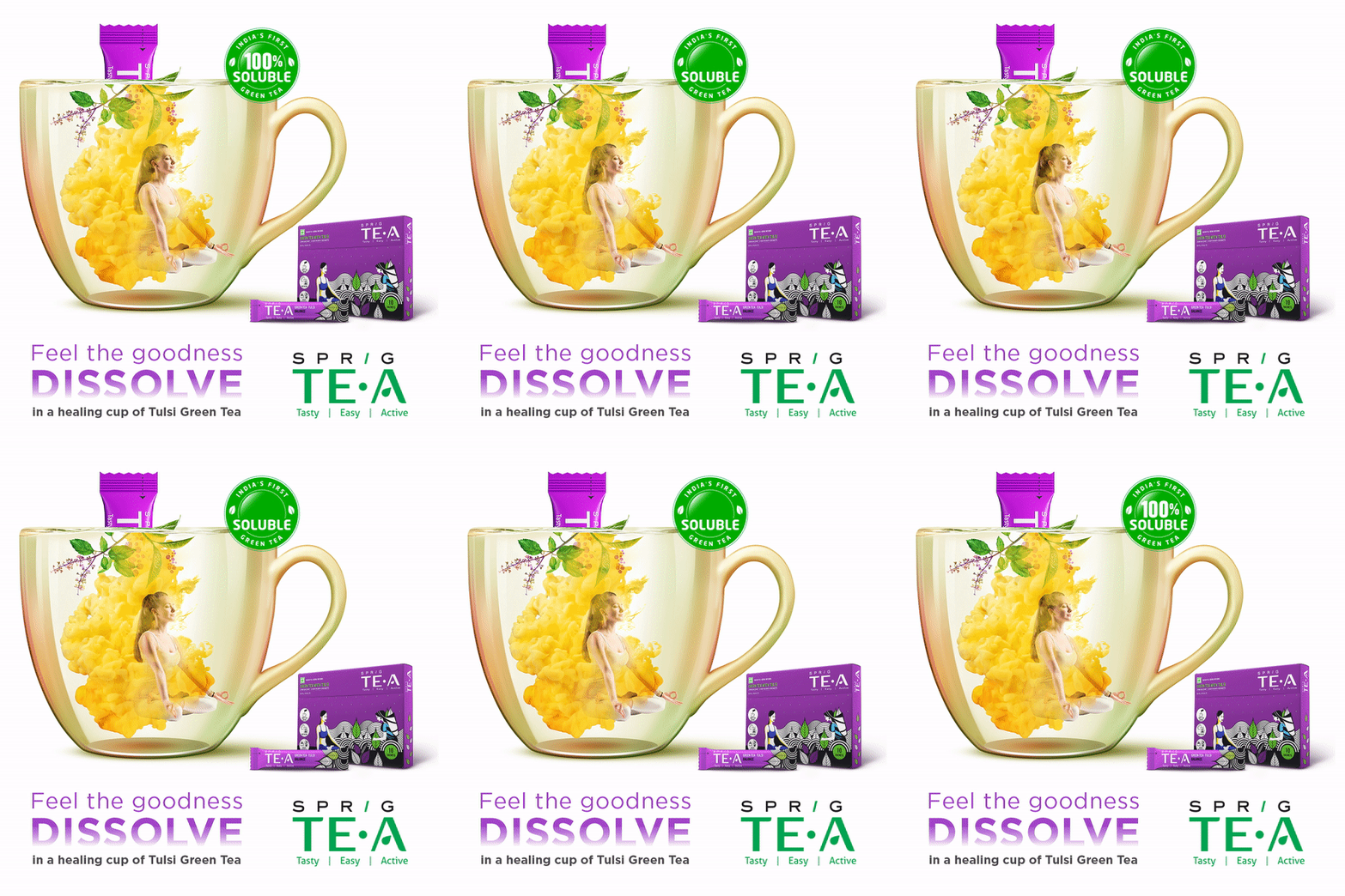
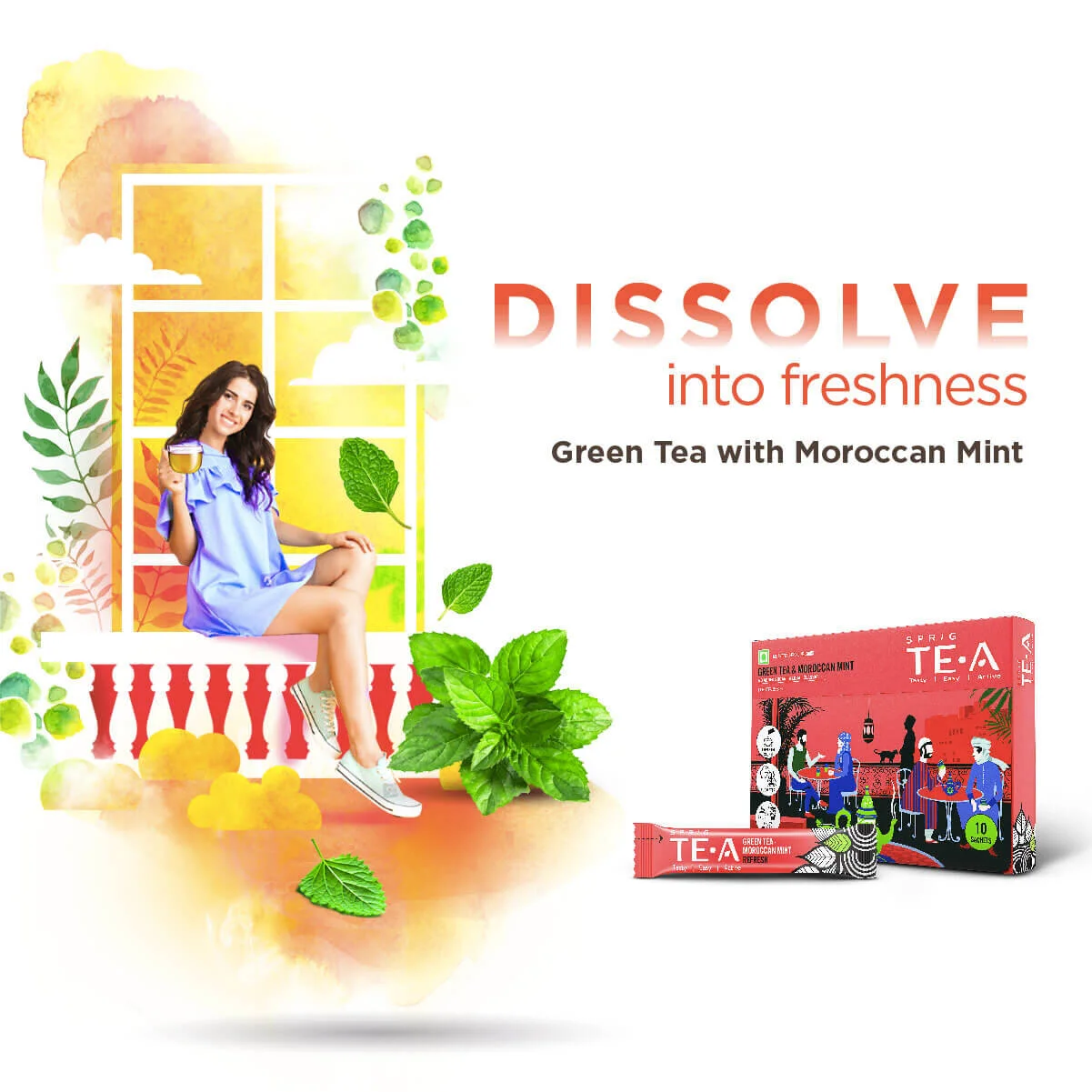
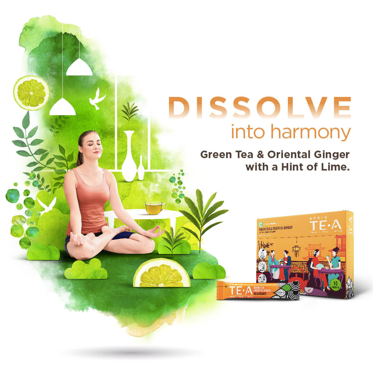
Our digital communication brought alive the ‘dissolve’ aspect of the brand, by leveraging the medium. With the help of GIFs, we created each ad with a dreamy, dissolve effect, to give the viewer the sensation of dissolving into the goodness of the tea.
We also used GIFs to create other interesting pieces of communication to tell brand stories of the tea coming straight from the tea gardens, into your cup.

