
Sprig
We are sitting across the table with the world’s largest producer of natural food extracts. He wants to take it to the next level. So we pay very, very close attention. The brief: Create a brand of premium gourmet food products using some of the world’s finest ingredients and natural food extracts. So many reasons to salivate.
Identity Design
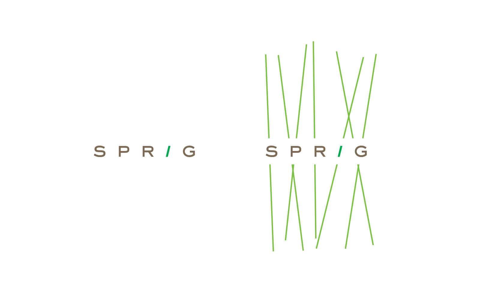
Brand Graphics: Continuing in the elemental spirit of the logo, the brand graphics were created to map across collateral lines. We call them ‘Spriggles’. From stationery to space design, this mnemonic subliminally carries through in all non-verbal communication.

Inspiration for design

Inspiration for design

Inspiration for design

Identity
Stacked Identity
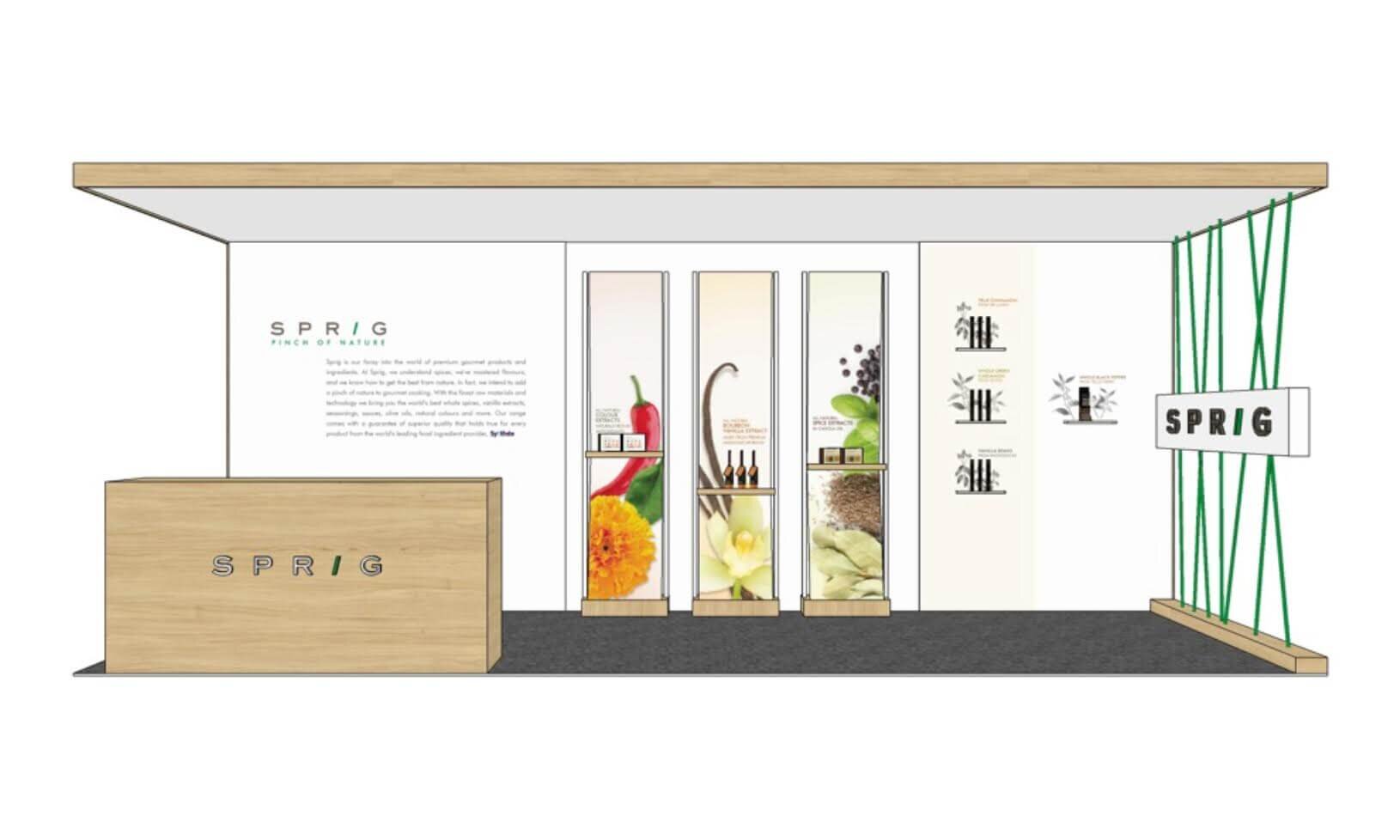
Identity Extension

Identity Extension

Identity Extension
Packaging
The end-goal was to design premium hued pack, bottle and labels to establish the extra-ordinary antecedents of the new brand
For the design process, we followed the following guidelines to deliver the intended results all without compromising on retail shelf presence
Extraordinary Differentiation
Innovative Materials
Minimalistic Elements
Extreme Authenticity
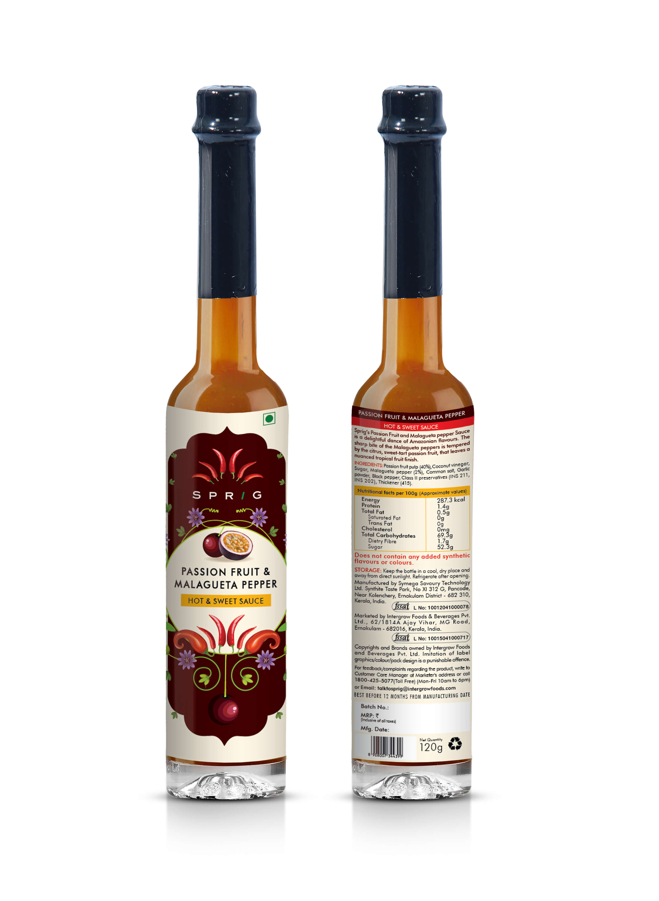
Sauces & Extracts
A colourful and diverse range inspired by base ingredients, its colour, its texture, its provenance and above all by the stories that lead to the creation of these inspired products. These were all one of a kind products retailed in beautifully crafted bottles. They are used extensively as gourmet accompaniments and flavouring agents. Also, adorn many shelves as collector’s items. A classic combination of fine produce meets fine art.


Gourmet Honey
When we think of gourmet honey, we think of the luxurious experience of slowly drizzling it over your food, with a honey dipper. So we decided to use the grooved dipper as the inspiration for our packaging. By recreating the dipper with the flavouring ingredient in each variant, we brought alive the infusion story, in the most minimal and stunning way. The hive-shaped label was a subtle finishing touch to this fine packaging.

Inspiration for Design

Inspiration for Design

Packaging Design
Gourmet Paste
The inspiration for the range was derived from those parts of the world where the ingredients originated. We referenced hundreds of relevant materials like ethnic / tribal art, textiles weaves, temples art, cultural elements and numerous other potential sources. Once these were shortlisted, we created multiple pack designs for each variant. We tested these packs for shelf throw, consumer likability and premium hues to arrive at the final design for each variant. The end result is a stunning range that looks more like a piece of art than a pack.

Inspiration for Design

Packaging Design
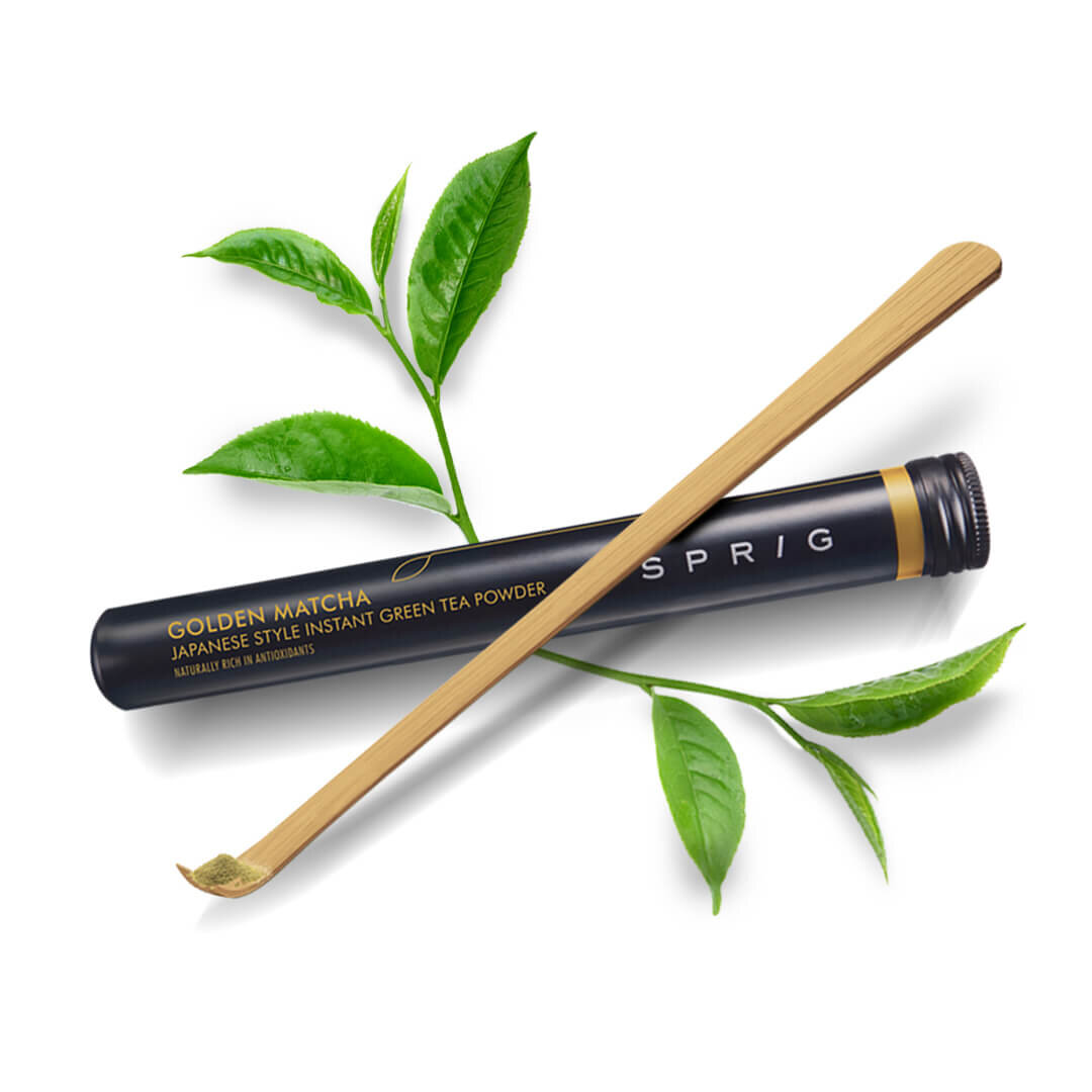
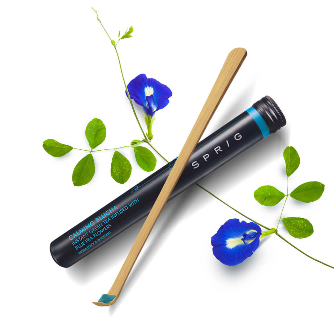
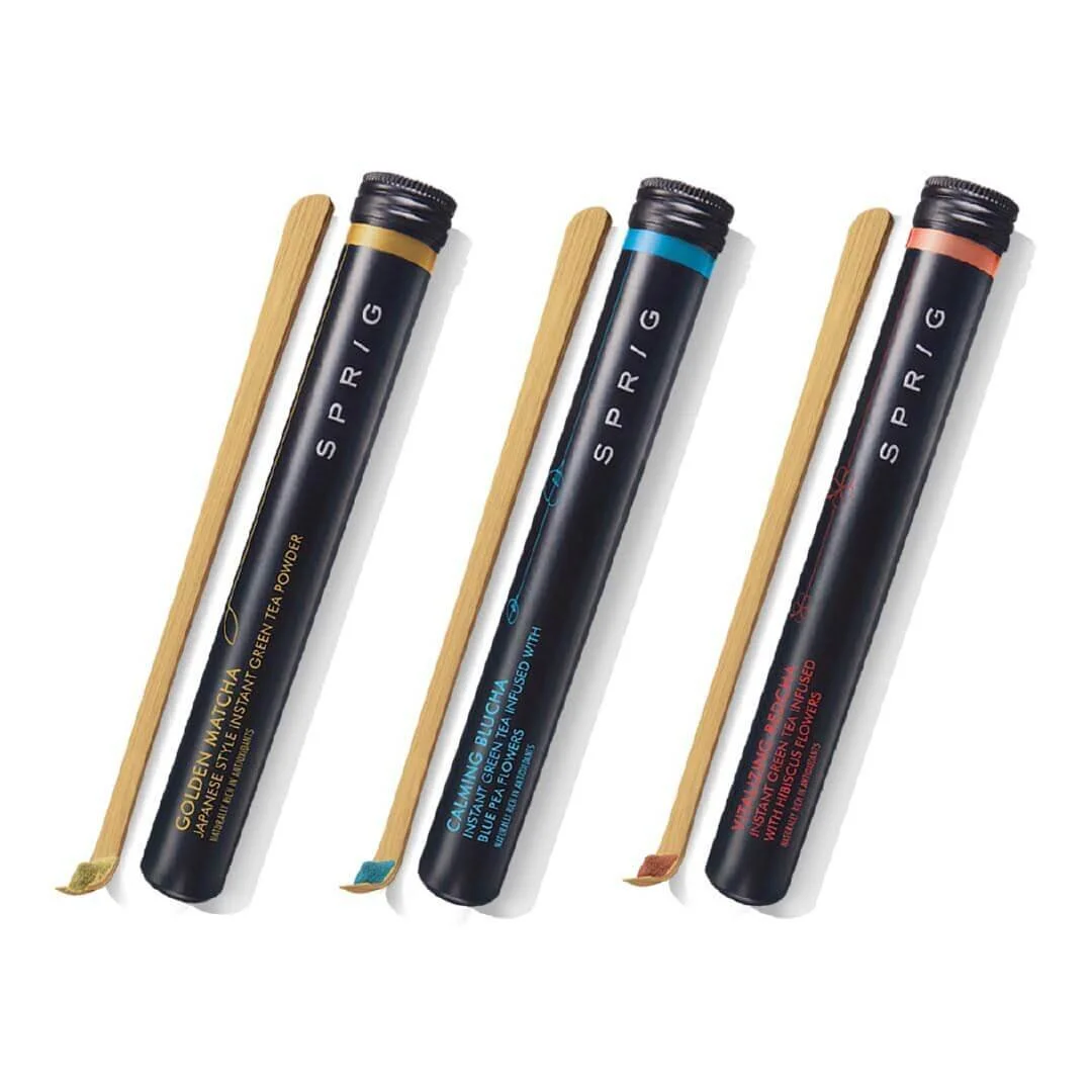
Green Tea
The one thing we did not do was to design the pack to match the colour of the base ingredients. We decided to go minimal to match the Japanese influence on the product. This led us to designing the now iconic tubular container with bamboo matcha spoons as value add-ons. This helped in generating immense curiosity and helped drive conversations in the category for brand SPRIG. A clear case of design driving brand trials and positive consumer reviews

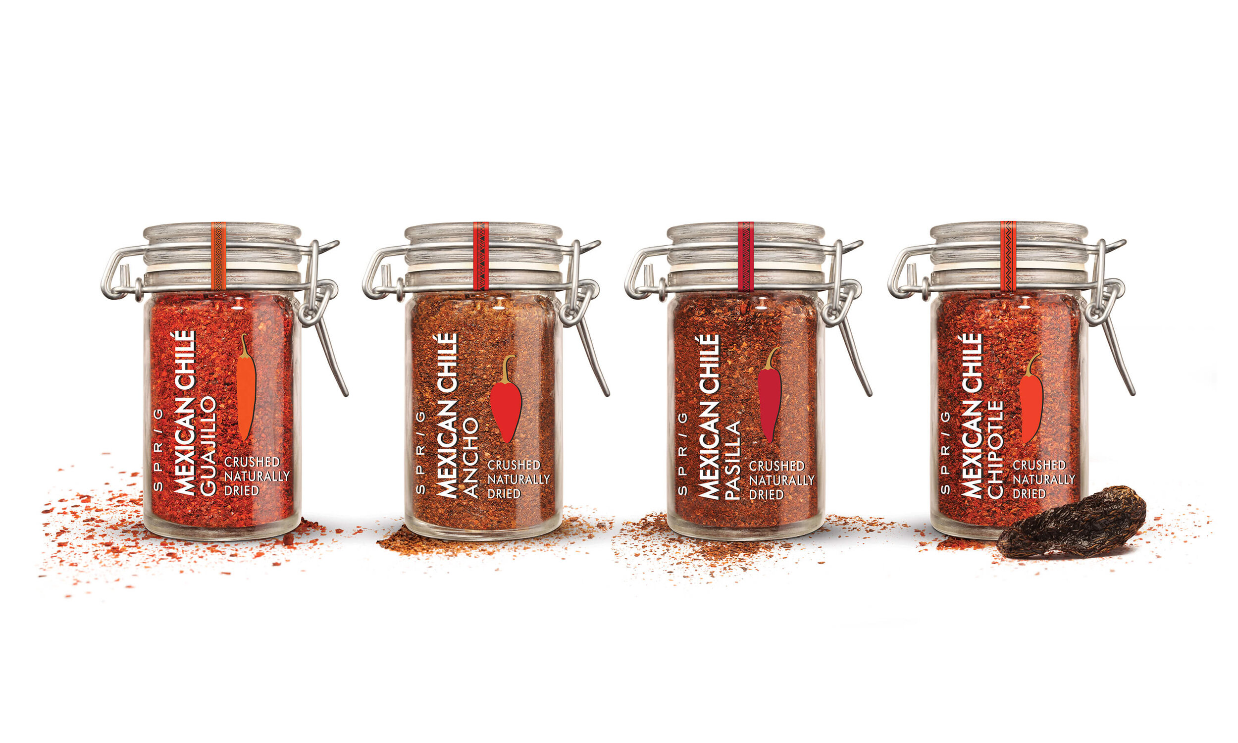
Mexican Chilli Paste
Chilli is one product that has many passionate aficionados and our range was primarily targeted at this segment of users. Their ability to differentiate one variant from the other through the shape of the chilli-pepper and colour of the flakes were used to our advantage. The packs were made transparent for this reason. Variants were differentiated based on vector chilli-pepper art and smart use of text.

Inspiration for Design
Packaging Design
Pepper Range
Simple yet highly impactful label design for some of the best quality peppercorns available in the country. Transparent pack with neck tags acting as product descriptors.


Sugar
The real beauty of brown sugar lies in its warm brown colour and rich texture. So what better way to package the product, than to show it off in glass mason-jars with an elegant label. We designed the label to highlight the infusion ingredients- cinnamon and vanilla bean. Classic and sweet, just like this sugar.

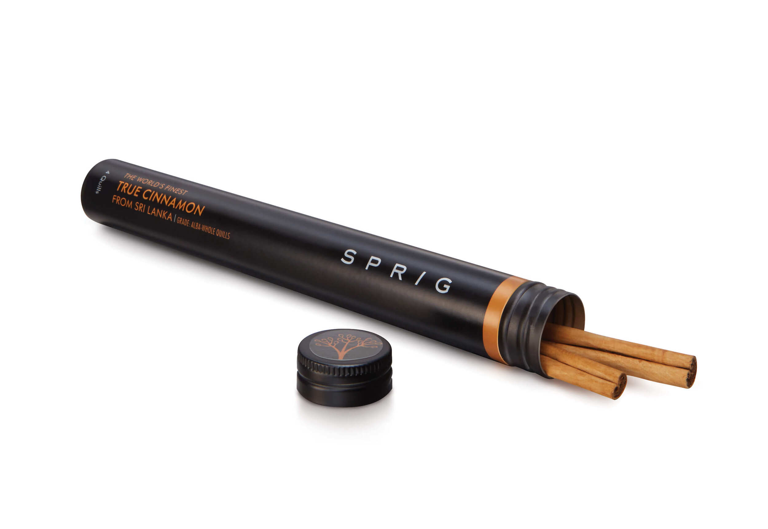
World’s Finest Spices
Innovative containers were fashioned for this range. Whole spices and ingredients were packaged like rare cigars. The economy of colour and typography brings it all together


Jam & Marmalade
When your product comes in flavour pairings that make your mouth water, you need little else to tell the story. In keeping with SPRIG’s ‘less is more’ philosophy, we decided to simply showcase the beautiful ingredients of the jam, through the packaging. We choose to keep the rest of the label all-black to let the oranges and yellows from the peach and ginger, truly pop. An exquisitely simple design to make breakfast feel like fine dining.


Magazine Ad
How does a gourmet brand, with products designed for connoisseurs, endear itself to the rest of the world? By being a little tongue-in-cheek.

