Kitchen Treasures
Purity begins in the kitchen
Launched around the festival of Onam, the campaign focuses on “Purity begins in the kitchen” and celebrating small moments while cooking. The new TV campaign delves deep into the emotional significance of a kitchen in the house. The brand has always been positioned on purity, and this new proposition builds on the logical progression of that idea. The idea sprouted from a consumer insight that came up in research. The brand endeared itself to the consumers, and in local parlance, the brand name has been contracted to ‘Kitchen Masalas’.
Kitchen Treasures | Chicken Masala (Malayalam)
Kitchen Treasures | Sambar Powder (Malayalam)
From Synthite Industries, Kitchen Treasures was targeted at the mass market segment with a clear intent to gain market share from well-entrenched legacy brands. We decided to follow the classical pack strategy for KT’s range of products. Our pack design attempts to idealize a period in the past when the ingredients were purer, flavors were richer and food was more wholesome. This was to give the consumer an escape from today’s frantic lifestyle, an antidote to a world of continuous change. It allowed the consumer to go back to a time with a slower pace of life, where attention to detail was paid by pouring love and passion into the products.
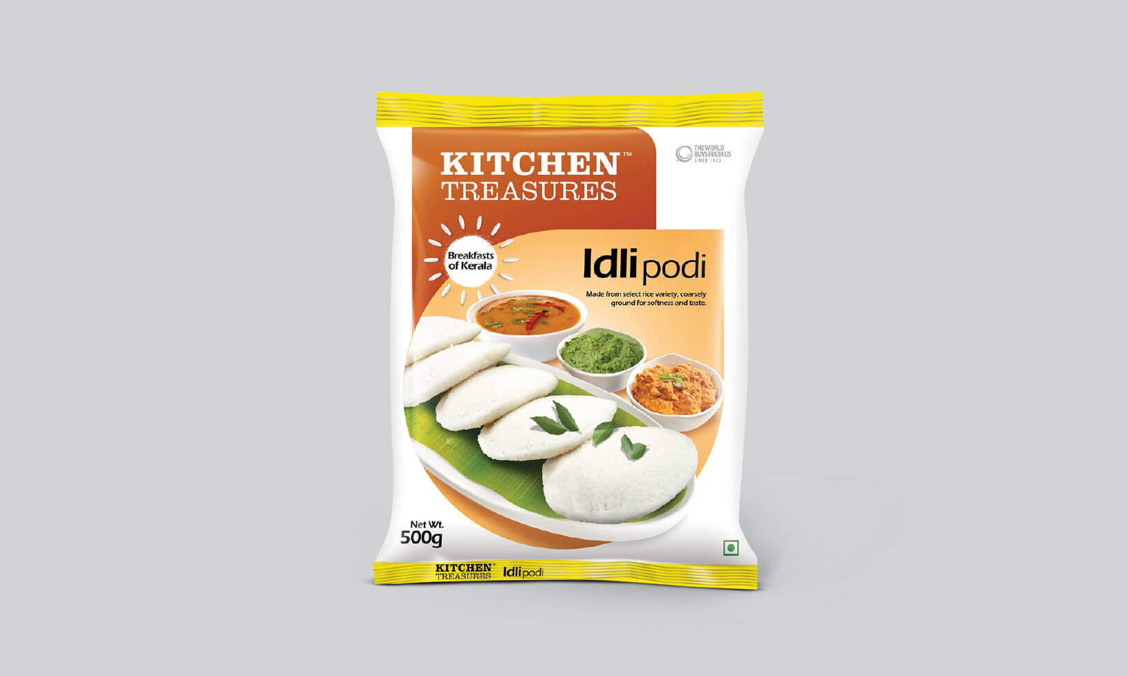
Breakfast Range Packaging
We took this proposition of an ‘easy breakfast’ and translated it into an ‘elaborate breakfast’- after all less time to cook would mean more time to eat. Hence visuals of elaborately laid out traditional breakfasts have been used across the packaging. The design was kept clean and crisp with tempting food shots as the dominating element.


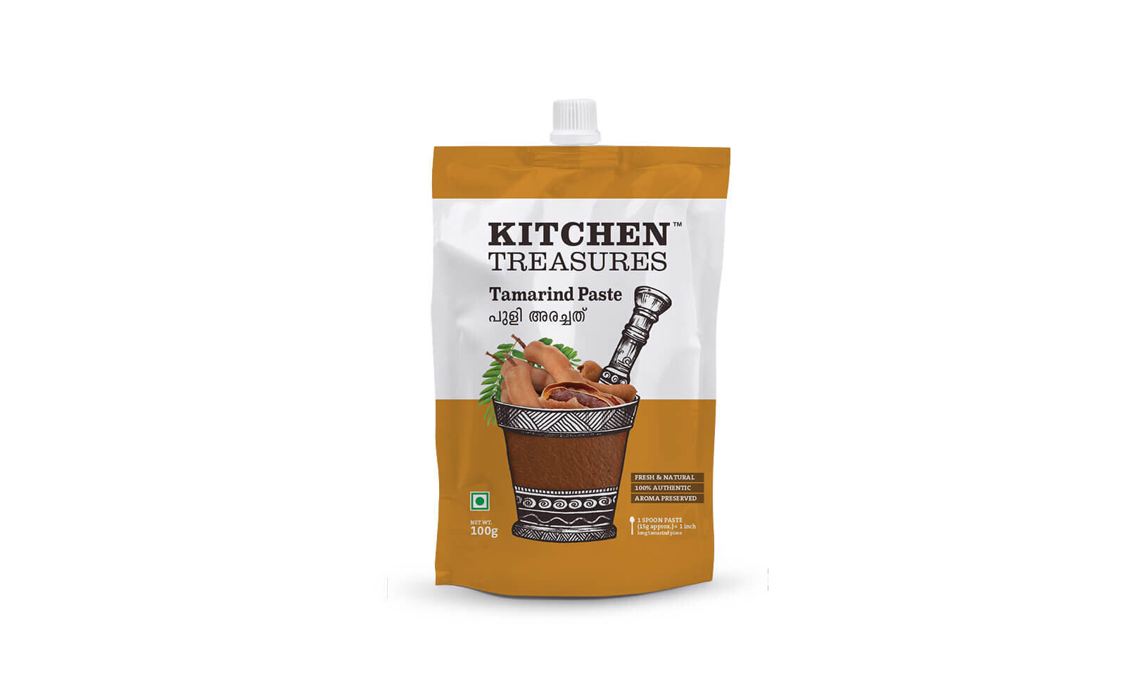
Culinary Paste Packaging
Understanding the ‘use and store’ for later use aspect of this category we decided to go for a toothpaste style soft squeeze pack. The visual mnemonic is of the pestle which has been traditionally used by women in India to make essential pastes used in all our curries. A classical Illustration depicting the same was the centerpiece of the packaging design.


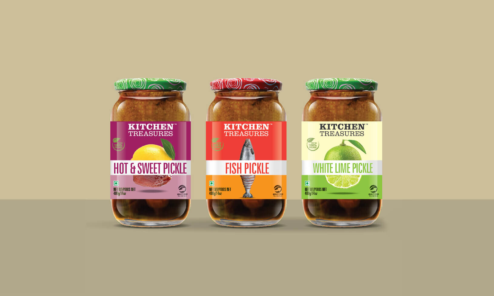
Pickle Packaging
For pickles, we adopted a starker approach with a large base ingredient image and clear typography. This was to ensure shelf visibility wherein consumers with a single glance could decipher the pickle variant. This also enabled the brand to quickly stand-out among the numerous me-too packs on the shelf.


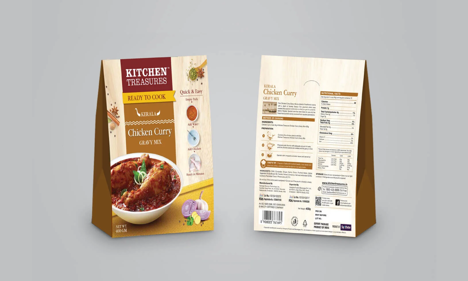
Ready to Cook Packaging
This range was an attempt to offer the consumers some of the best loved dishes from Kerala in a ready-to-cook avatar. Care was taken to ensure that the quick and easy nature of the product didn’t not take away from the promised end result i.e. an extremely appetizing traditional dish. Front of the pack had traditional elements like spice and condiments along with quick + easy use instructions. Like in all other KT categories, images were larger, food-styled and shelf-friendly


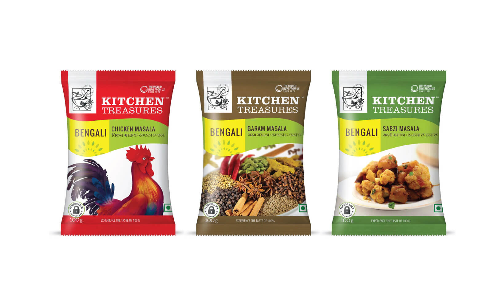
Masala Packaging
These packs were a massive challenge since it had the most intense competition among all the operating categories. The challenge was further accentuated since we also had to create a distinct marker for the state of origin. After a detailed market study, we decided on multi-colored packs with each state represented through use of a unique color. The pack also used the classical wave design as the highlighter with a clear image at the centre of the pack.